Thursday 21 March 2013

Looking back at your preliminary task, what do you feel you have learnt in the progression from it to the full product?

Looking back at your preliminary task, what do you feel you have learnt in the progression from it to the full product?


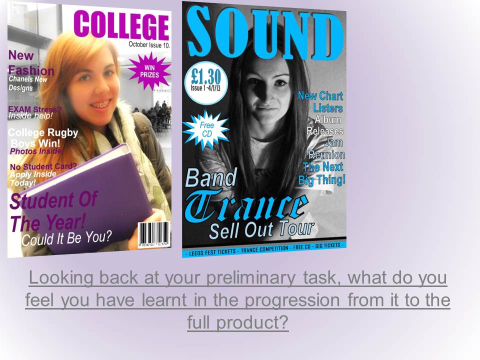
For my preliminary task I created a magazine around the topic of college. Since the preliminary task I have learnt many different skills that will contribute to the final product of my music magazine. These include the Photoshop skills, publisher skills and Picasa skills also. These are the practical skills I have achieved since the preliminary task, however also I have learnt different things about the music industry and how different colours and layouts can attract different audiences. One of the main factors that have improved my skills is my photography; I think this has affected the whole look of the magazine and changed the standard and quality of my work.
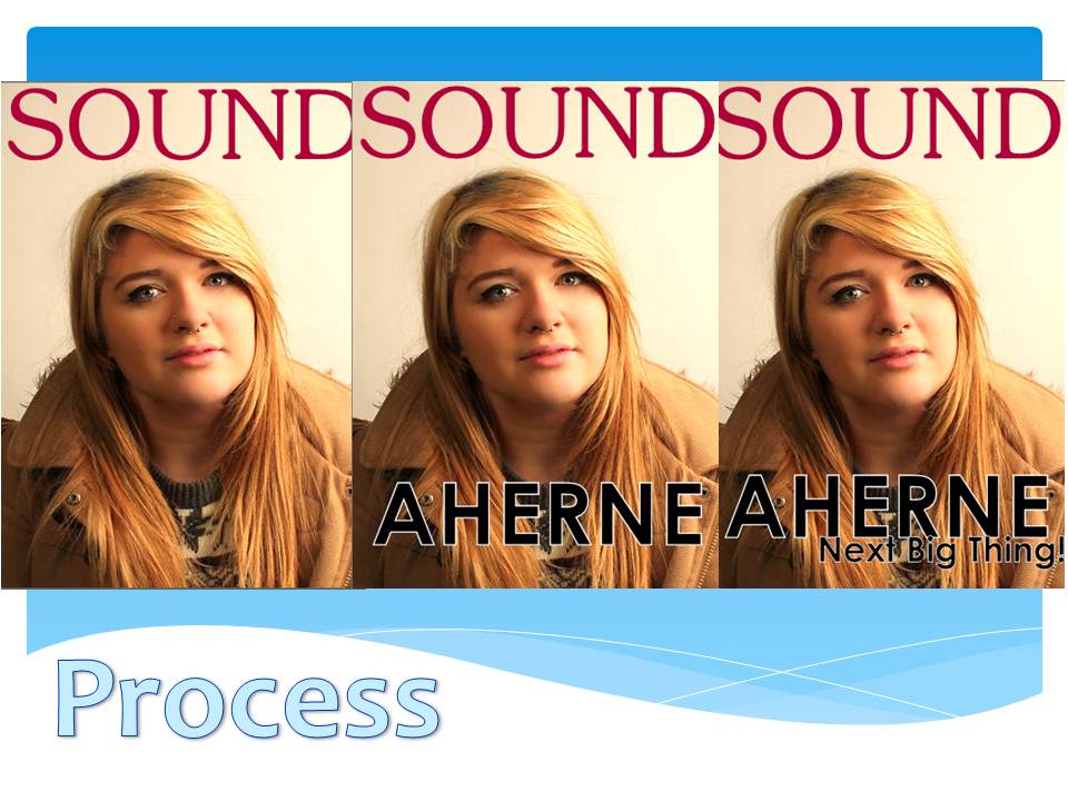
Throughout my preliminary and the drafts of my cover especially the photography let the rest of my work down, however I think the improvement of this has created a better more professional result. I learnt about having 
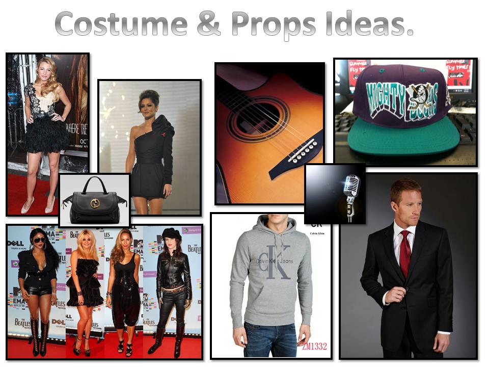
different ideology for the college magazine by having props such as books and exercise material within the college campus. However I had to change and adapt this to a fit the music magazine I created. I have tried to create a more professional shoot which I took within a studio with spot lights that look similar to stage lights, with a curtain behind the model. I think this is better fitting to the music magazines, and I used what I had learnt from the college magazine and adapted it to fit the brief that I had been given.
Also from my preliminary task I had not thought of the different demographic differences and pricing of the magazine depending on audience. Also the distribution ideas and unique selling points, this I gradually added to my final magazine by researching. Another thing I never thought would be important for a magazine at the start in my preliminary was the colour scheme and how that could change the dynamics of the product completely, from different genre to different target audiences just with adapting and changing colours. I have considered this more within the final task more than I did for the preliminary; I think this is one of the factors in the reasoning of why the music magazine was of higher quality to the college magazine.
I think my editing skills in changing and adapting photographs has improved, I think the contrasts between the imagery from the preliminary to the final magazine are very different. With all the factors that have improved and changed I think something that has been kept the same within the front cover is the layout. I think it’s similar when you look at the two together, however the new final layout is more structured and I designed and based this on different magazines structures more effectively. However I think my two content pages are incredibly different. The college content page has none of the conventional aspects or very few that are seen on the new music magazine. Also some of the content is very different due to the different genres; therefore I have learnt how to adapt the same concepts and ideas to different ideas within media.
All my computer skills and program skills have been improved by doing these tasks, and have changed a lot since the first preliminary task. Publisher and Photoshop were both programs I knew very little about however experimenting within the programs to create different effects has improved on my work and general knowledge of different work on the computer. I think overall all my skills have improved in some way in all areas, I think these skills are useful to adapt and put to other things within other aspects of media such as the music industry exam assessments. I also think the exam side has helped me understand the distribution industry and how products are marketed with their competitors.
 

What have you learnt about technologies from the process of constructing this product?

What have you learnt about technologies from the process of constructing this product?


I have learnt within this topic how to do many different functions within the Photoshop and Publisher applications. These include all the tools on the Photoshop tool bar and also I have used some of the tools within publisher for the creation of my magazine. I have learnt how to edit photographs and change colours of models hairs, also eye colour and clothing colours. I have shown this in my drafts and shown the difference between the start of the Photoshopping process to the finish. All of these of which, I never knew how to do previous to starting this topic. I am pleased with how my skills have changed and adapted and I feel confident moving around Photoshop. These are some of the tools I have used, and what I have used them for.


How did you attract/address your audience? Who would be the audience for your media product?


How did you attract/address your audience?

Who would be the audience for your media product?

There has been many factors I have considered when deciding how to attract the audience and customers needed to create a successful company. Something I have considered and put toward is the idea of distributing the magazine within current magazines; this creates potential customers and public interest. Also there are different audiences that may not be the target audience that may read the magazine and enjoy it. I think this strategy is better than selling it individually as the audience may just go to their usual magazine without even considering a new product within the market.

Also I think advertising the magazine at the concerts that the bands featuring are at is a good selling point for the magazine, introduces an consumer that is clearly interested in the content first had to the consumer. With also the wide range of bands that are going to be featured within the magazine, from popular well established to bands that are only starting out, creates a completely different audiences coming together to read the same magazine
 This ultimately creates a huge audience base therefore the magazine can be targeted a particular audience; however it is accessible to a wider audience in some aspects. I think also a good strategy to attract the audience would be to keep the main features with well-established bands; therefore the audience recognises the band’s name and are instantly attracted towards the magazine. I think having an unknown band featuring on the front cover wouldn’t grab the consumer’s eye in the same way as people tend to naturally stick to what they already know and like, and they don’t have a wide established fan base. I have kept to this idea with having a band reunion on the front of my magazine; this attracts the current audience of the fan base to the magazine as they will be interested in reading about the news of the band.

Also I have added features within the front cover that will attract the audience to buy the magazine; this includes free CD’s and deals on concert tickets. These are promotional offers, I think this will attract this audience base because the average concert ticket for this alternative audience can go up to £200, festivals and concerts such as Leeds fest are increasingly popular within this alternative audience, therefore they are more inclined to purchase and buy the magazine. This is popular within larger magazines companies, and eventually if the magazine became popular within the music industry the artists would supply tickets to win and CD’s that are purchased at a discount for their own publicity.

Another factor I have considered is the cost of the product, and how that would attract the audience. I have priced my magazine as £1.30 per issue which is published monthly. This cost will be added to the overall cost of the product when purchased with another magazine, or just the single price for the magazines that are sold singularly. I think the demographic band that my product would fit in to is the band labelled C2 bordering the D section which is for skilled workforce. Although my product could be purchased by people higher up the demographic band, however this is my target audience. I think having the price at £1.30 per month targets this demographic band because they will be able to spare this money for the magazine per month, where as if I priced my magazine at £5, my target audience may want to consume the magazine however cannot afford it. I think this target audience is the most inclined to be interested within this music genre, as higher bands are stereotypical associated to like classical orchestrated music therefore having the magazine at this price wouldn't attract the people that could afford it.

Also I think having it at this price and having all the promotional offers will make a potential reader feel they are getting a product that has something to offer them in return, as most people enjoy something for a discount or free. I think these factors show that I have catered to the C2 – D target audience, these of which are generally unskilled manual workers, or skilled manual workers.

Also another factor I have considered when trying to attract my target audience is that the majority of music magazines are target at men however they are actually purchased and read by women. This has been proven with magazines such as NME which is one of the magazines I have taken inspiration from. Therefore when deciding on colours and format for the magazine I have kept most of the colours conventionally male dominated, however I have changed them to lighter colours to make them assessable for females also.

Also I think this is something different and diverse from what other magazines have to offer, this may be proven successful. I think this change will attract the audience that I need to create a successful magazine to my magazine. I think also these colours will stand out amongst the other magazines on offer already on the market, and on the shop floor at a distributor. I think this will also create a branding that the consumers will associate the magazine to, therefore indemnify with it and recognise it as unique between the competitors.

Demographic Table

Tuesday 19 March 2013

What kind of media institution might distribute your media product and why?

What kind of media institution might distribute your media product and why? 

The type of media institution I think would benefit my magazine the most is one that already exists. That also has products which are similar to the product I’ve created. I thought for distribution at first to create interest and try and get my product more popular would be to combine the two within a package and sell them together. This would happen until the product is popular enough to sell itself. This would create interest in the right audience for my magazine and go to people who genuinely show an interest in the genre.
I think a good example of a magazine that could stand alongside with my magazine would be Rolling Stone magazine. The average copies sold of every issue is around 1,453,158. Therefore distributing my magazine within there's will ensure a large amount of people buy and view the magazine. 

This creates potential consumers for the next issue that our magazine would bring out. It has proven that this method of distribution works and many magazines have started out like this. I think within trying to get in this competitive market the only way to become popular is to work with other magazines who are already successful and gain the knowledge and skills to eventually stand alone within the UK retailers. The current distribution of Rolling Stones magazine is online and in shops in many countries. Currently Rolling Stones does not distribute to the UK however they are very popular in countries such as America, this is proven successful therefore this would be a great distributor for over seas. 
I think also a similar idea and contract with such magazines as Q within the UK would benefit the UK retail market within the same way. Therefore my magazine would become more popular within the UK and over seas. This would be part of the the globalization strategy on how to get popular world wide. By having my magazine within the Q magazine in the UK, I think this targets a completely different audience and may introduce American music more within the UK. Also this could happen vise versa within America being introduced to more UK music. 

The main magazines I have looked at and been inspired by are only sold within the single country that they are produced. I think the idea of having a single magazine for more than one country will create more audiences and interest more people within music they didn't know existed. I think also having different distributors it would interest more artists and bands to feature within the magazine, they would recognise that the product is being sold within other countries and reaching a wider audience with new potential fans. 


How does your media product represent particular social groups?

How does your media product represent particular social groups? 


I think the social group my magazine is based around is a male or female audience around mid 20’s which are in to band music or alternative music. I have chosen this social group because its stereotypical for being mostly males and I have incorporated this within the magazine by using the blue colours. These darker colours are associated more with the male gender therefore it will attract potential buyers who are interested within this music gender. Also within the pictures and articles it refers to females which is going to attract males rather than other females.

Within my research I based this around scene audiences however I felt this ideology was difficult to recreate and the audience was too narrow as there is all types of different scene cultures to cater for. Therefore I changed my ideas to fit a different range of audiences within my magazine. I then changed this idea to a magazine that fits more social groups, the genre is a rock band genre and I’ve added articles on up and coming bands and reunions within my articles. This is due to this stereotypical view is of fans who enjoy a variety of different bands and always look for new ones to listen too. Also they are stereotyped to go to garage gigs and also spend a lot of money on concerts such as ‘Leeds fest’. This social group becomes bigger each year and the market is growing for wider magazines with less mainstream bands featuring within it. I think this is the approach I have achieved within the design of my magazine.

Also by using the photographs of younger people within the magazine, I think this appeals to a younger audience. This is due to the fact that they get the impression that the articles are relevant to themselves as they can relate to the age group of the artists. All this information is conveyed by just using the conventional photographs within the pages of the magazine. I think this is useful as most people tend to judge an article on its appearance rather than what the content is. If they can visually see something interesting and relatable, they are more likely to read the article and take an interest and buy the magazine.
Within pricing my magazine I decided that the price of £1.30 per month. When making the decision on the pricing of my magazine I looked at prices of other magazines and compared them. I also realistically asked different people what they would be prepared to pay for the product per month. I think the price I ended up with is a fair price and with the target audience being so wide and including a lot of people many copies would be sold within the high street.
When looking at my reader profiles I considered the medium age for all the reader profiles that I found. This helped and allowed me to identifying the target audience I was aiming for looking at NME and other reader profiles it showed a pattern of the age range of purchasing music magazines. This age range was from 18-22, therefore I am trying to aim my magazine at this age range. However also from looking at the statistics of the reader profiles I’ve learnt that overall less men purchase the magazine than women, I found this interesting as the ideology and conventions of the magazine were very male stereotypical. Using this information I adapted my magazine to be more neutral, however still maintaining the male ideology because it seems successful to the major magazine companies.

In what ways does your media product use, develop or challenge forms and conventions of real media products?

Conventions on individual pages 


-

Conventions overall

Throughout my magazine I have tried to achieve continuity between all of the pages of the magazine. This is a convention used in magazines, for example the text of the 'Trance' band the font is the same throughout and it shows visually that the feature from the front relates to that article. This creates an identity for the band also within the magazine, it is then easier for the 'Trance' fans to locate this article within the magazine. I think this shows a more professional approach to my magazine also. I have even done this within the article text itself to re-enforce this ideology. 

Also within my magazine I have used different pictures to suit the page I was creating, however I have used the same model and person. I have even created the same kind of style within the photograph and edited it in a similar way. I have kept the black and white as I think it looks more professorial and it created a theme throughout, it also allowed the text to stand out better than having the picture in colour. Also within the magazine industry conventionally it should have 3 colours that are constant within a magazine. I have tried to achieve this by using black and white however mostly blue. I think the blue colour has created a theme for my magazine overall, this is very different from the ideas I had at the beginning of my task. All these are conventions of a magazines and the ideas that I have taken form researching other magazines and adding them to my own. 

-


Comparing to current products, and their conventions


I have used these examples of the music magazine NME for inspiration for my magazine. I have used some of their conventions on my own pages. I took inspiration with the colour scheme, I liked the convention of having a black and white imagine and using these colours within the text, along with another colour to create the 3 conventional colours that I needed. I have used the ideas from the double page spread of having a pull tag around the text; this is conventionally used within magazines to draw in the audience. The pull tag from the NME magazine example is a quote from the text that will interest the audience. This is something I took and re-created on my own magazine, within the article I wrote I decided on something that would draw the audience in and created this as my pull tag. I put this almost the article as this is often done within magazines. I think the idea of putting it within the actual article is better than the magazine example; this is because it draws the eye directly to the article and attracts the audience to then read the article.

Within the front cover example I have taken inspiration from the bar going along the top of the magazine displaying information; however within my magazine I've placed this convention on the bottom of the page. I have used a similar layout and my inspiration for my layout came from NME products, however I’ve swopped some of the conventions around.  For example I have placed my feature heads in the conventional right hand side of the page, this is to conform to the conventions that NME use, they are successful  and work on the retail market therefore I have applied them to my magazine. I have placed the barcode in a similar place to the example as through my research most magazines in general not just in this genre have their conventional barcode in the right bottom corner.  Also underneath the title of the magazine it has the issue number and the date, this is something I’ve achieved on my magazine. I have also placed the price for the magazine in bold underneath; this is also something that is inspired by the example NME front cover.

These products also inspired my photography conventionally all magazines have photography; however it can be edited in any way that fits the photography type. I took these examples and decided to create something that would fit to be edited into black and white. I did this because I liked the contrast between the coloured article features and the black and white background.  Some magazine covers are conventionally edited in colour, however I have decided not to do this and make the features a main focal point to draw in potential buyers. Within the double page spread from the photograph that I have used like the example they both have a negative space background, with positive background. This means that the background for the photograph is dark and the writing is light, this is not conventional of text, however is often used in magazines. I think this works well and looks better to the conventional negative on positive because its more interesting and draws in the audience more. 

Thursday 14 March 2013

Feedback on Content Page

Feedback On Content Page

I like your contents page and I think the image you have used is really nice. I also liked the fact that you have the QR code in the corner to scan as that's a good feature to have. The only thing bad is that it's a bit too plain and it would look better if a bolder font was used, but other than that it's really good! I do also like the font and colour scheme you have used on the 'Contents' part where you have listed the page numbers. Overall, a good contents page. - Tyla
-
 
Becky Marrow

Strengths of your contents page include that it's brightly coloured so will catch peoples' attention, the colour scheme matches and pulls the whole contents page together a lot more, the photograph matches the genre of your magazine and you have included an editor's note which is very conventional.

To improve you could maybe change the size of the qr code, as it seems a little too big for page and add some more contents in your list to fill up more space.

-

Good contents page, the text is a little bland which does make it obviously a fake one, and could use some more images on it - Danny

-
I really like your contents page, it sticks to the colour scheme and the layout is really good!

To improve you could maybe use so more original images, 

Well done keep it up!
Lauren Richardson :-)


Feedback on Front Cover


Feedback on Front Cover

KINGMASI 
  • The blog has a cool background but the font could be changed to a nicer looking one.
  • The front cover is good but the font is a bit boring for the features and that could be changed. The barcode is a bit big as well and over laps the model. Could also try and work on the model looking less like they've been cut out.

    -
    Lauren Richardson 

    I love your blog! The layout is great! and you've done loads of research and you Ed Sheeran images/video are fantastic!

    Your front cover is pretty good! I like your layout and the colour scheme as well as your imagery.

    I think you could improve by adding a header and footer as well as rearranging the placing of your date line/price and re-sizing it.

    -
    Ellie Broughton

    You have done loads of work and I like your background on your blog. The layout for your front cover is very conventional however I think you need to change the font and colours as it kind of looks boring, but with these little improvements I'm sure it'll look great.

    -
    Becky Marrow

    From looking at your blog I can see that you've done loads of work and tried really hard. The process you went through to get to your final front cover can be see clearly, and I think that your final front cover is really well done.

    Your final draft follows convention and suits the genre of your magazine really well. The image you took is really good, and I like the colour scheme too.

    To improve I would maybe change the colours of some of your cover lines to add more of a variety and make it more eye-catching.

    -

    Acting on Feedback

    -

    To act on the feedback to change my picture and spend more time editing it, to produce a better picture. I am going to change the size of the barcode and maybe look at changing some of the colours. Also I may change the place of my headings and the arrangements.

Thursday 21 February 2013

Double Page Spread


Draft 1


Draft 2


Double page spreads 

Draft 1

This is the first draft I have produced for the double page spread part of my task. I am pleased with how the photograph has worked within the page, I experimented with changing the background white and having the writing of the article black. However I felt it worked better with the contrasting dark background against the white font. I have tried to crop the whole of my picture to produce a full background of photograph, rather than a block colour at one side of the page. I decided to do this to create continuity between both pages and I think it just generally has a better appearance when  putting it together. The writing on the left side of the page reflexes the writing on both the content and also the front cover, I think the relation between the band and this font creates a imagery and identity for the band. I think to a possible reader they can clearly see by this what article within the magazine is relevant to the band, and which are not. 

I am pleased with the colors of this draft, I think its quite subtle however I think it looks more professionalism than having a really bold color. I have tried to compromise this by having a lighter font within the article at key words and when the band is mentioned. Things I've decided don't work well within this draft are the page numbers being at the top of the page. I originally did this so that the article could be placed on the page without having to be adjusted to go over the face of the band member. However now on reflection I think this convention is important when putting together a magazine. The audience and reader will look at the bottom corners of the page for the page numbers when flicking through the magazine. Therefore my ideas within the draft regarding this would not realistically work. Therefore when doing my next draft I am considering pacing the page numbers in the conventional place. 

Also on this draft I am not happy with the title on the left hand side page, this is due to conventionally it is placed within the right side of the page. I think on reflection I will change this to somewhere else. I am pleased with the fonts on the page, I like my idea of incorporated the text font used for the band in the article when and where the bands name is mentioned. I've also changed the color of these to make them stand out. Regarding my article however I am considering changing it to a Q and A bullet points, instead of embedded within the text. This is due to the fact that it will be visually easier to the read for the audience. Also as the article stands it is quite confusing and think it needs to be made more basic to appeal to any audience. 

Draft 2

Underneath my first draft is my second draft. Within this draft I changed a few things that I was not pleased with in the first. Including the positioning of the text has changed from the layout across the face. I think this works better as a whole however this doesn't show much continuity across the pages. I think they are too separate and the audiences eye is going to be drawn to only one side of the page. I have tried to make up for this factor by changing the rights side of the pages title to a block color background to balance the pages visually. However I think this creates a more unprofessional look on the page, however I've added it to show the experimental side to my ideas. I think I am again going to change this factor for my final spread. I think also the titles been on the right side of the page, does not conform to conventions, and this makes it look fake and not proffesional. I've also changed the colours to read on this draft, to experiment further, however I've tried to keep these colours again very subtle because I think this look is very appealing. However overall I prefer the blue colour within this, I think it compliments the black and white colour of the photograph better. 

Within my next draft I am going to incorporate the ideas from both the first draft and second draft, and pick out all the things and conventions I like to create a final one. I think within doing this double page spread I've achieved a new skill of learning how to create media documents within publisher. My initial photograph was created and editing within Photoshop, which by the end of this media project on music magazines I have learn't a great deal about. I think these skills will help me in creating my final design. However all the text and fonts and experimenting with layout was done within the publisher program. I think this is helpful as I learnt the skills of how to put text within columns, which is a conventional process of creating a magazine article.


Tuesday 19 February 2013

Teachers Feedback


 I have looked and considered all the feedback I have been given, I am going to make the adjustments in size and change the amount of pictures on the page and so forth to create a better overall product. I think all the comments are fair, and the changes need to be made. I need to adjust the layout and add more pictures to the page. Conventionally the editors note goes in the bottom right corner, this adjustment will be made. Also conventionally there is 3 pictures within the content page, this adjustment also shall be made. I need to create more page titles therefore my magazine will look longer, because conventionally right now its too short, this wouldn't sell well as people wouldn't pay for a short magazine. Also the bar code needs to be made considerably smaller therefore I have more space for other things within my content page. Also the subscription advertisement needs to be placed elsewhere. 

Contents page


Monday 17 December 2012

Improvement


Example 1
The above is the type of shot I am considering for my front cover, think this position and layout works better than my draft one; however I’d like to incorporate a prop that represents music. I like the idea of having all the hair as a background as I found in my draft it was hard to add text with the busy background or the coat and its detail. I like the contrast in the examples colours and It looks glossy and far more appealing to the young target audience I am aiming at. Although I like the image on the example magazine I prefer my layout, I am going to continue to use this layout for the remaining drafts I will complete. I also think I should take the text size and pull tag size on board; this is because my first draft the text dominates the cover and leaves only a small visual space for the image. I am going to enhance the close up of the image and make the pull tag smaller. I also think the master head is oversized, and there should be more articles and text if I descale everything. I think I also need to experiment more with makeup ideas, and see how this affects my image. Although I'm struggling to get the correct look and make it look visually like a music magazine. All these are things I can take inspiration from to create a better magazine.
 
Example 2
I'm also adding this image as an example as the picture has been taken in a similar way as the above example, however the model is male therefore it gives a different look and feel to the magazine and also targets a different audience. I think this will be something I consider when re-taking me images for my magazine. However I can't use makeup ideas and some of the props that I was considering. However it will give me the opportunity to use different themes and colours with a different artist however the same genre. Again with this magazine I prefer the layout I created on my draft rather than the layout on this example. Also I am going to experiment with different font faces in my next draft in a way like example 2 has to create more interest on the magazine. I'm considering the idea of using a quote in a different font to identify it from the article title.
All these things in to consideration about the image and layout, I think I also need to change some of the elements of the things on the page. I have left out a conventional barcode and I think the cover could use a issue number and the article names down the sides could be smaller. I could also reconsider the font however I don't think the front is much different from the types of fonts on the examples. I've noticed they use capital letters and cap lock for their covers which is an idea I could consider. Also could experiment with the use of the 3 conventional colours and swap and change these to see what works best. The colours that I used for my draft I chose because they complimented the image I had taken, however re-taking my image would allow me to plan for better suiting colours.

Sunday 16 December 2012

Front Cover Design 2.

 
Draft 2
 
This is my second draft. The image I had previously used on my draft 1 I used again, I have photoshopped this image to create this look. I have airbrushed her face and skin and lightened it to create a better complection. I have also changed the colour of her eyes from green to red because it attracts the eye more and looks as if she has contacts in which a lot of emo/scene crowd actually wear. I have also changed the colour of her hair from brown to a pink/red colour, I did this because it is very themed to the current trends of hair colours the scene/emo background are taking on. I also changed the colour of her top to make it a grey because this fits and compliments the other colours.

I changed her coat from a brown colour to a brown to a black colour to create a darker look, it also contrasts well agains't the background. I think by doing this it creates a cape/vampire look which could also suit a twilight type of audience, this target audience has increased in the last two years so I think this works well. I decided to change the lip colour to a bolder red however I made this look more natrual. I kept the layout similar however I changed the font for the feature article because it looked more theemed within the magazine. I also cut around the white background on this one to create a competely white background.

Improvements I could make on this design is a different colour scheme because the colour of the models hair and the colour of the font and her jacket clash too much. I liked the idea of the colours pink and black however now i've put them into practice I have changed my mind and think red and another colour would of suited better. I also only have 2 main colours on this magazine, it is conventional that there are 3 main colours. If i was considering using this as my final design I would add a white or grey coloured text also within the page.

Overall I am happy with this draft however I have decided that I am not going to use this draft as my final draft due to the imagery still not being right for the magazine type I am going for. However I prefer this draft to the previous draft, and i've tried hard on photoshop to adapt the picture to fit within the conventions of the music genre.

I think that doing this draft increased my photoshop skills and I have learn't how to do things more to create a look and theme on photoshop. I think with the image I had i've created the best looking magazine possible and its increased my understanding of photoshop and I have learnt a lot by doing this design. I think this will influence the rest of my designs and I will use the skills I have learn't to produce a new design with a different picture.


Sunday 9 December 2012

Original image.


This is the original image, to get to this stage I set up the studio lights to position were I was happy with the lighting. I used the soft box to create a much softer natural light, then used a spotlight to enhance the models face. This picture was the best result I got in the studio, I think this picture worked well because of the reflection in the models eyes and also in the piercing. This photo has been Photoshopped, I've airbrushed all the skin and enhanced the colours within the picture. I've also changed the brightness and shadows within the picture and changed the levels. I also need to make the photo closer as it leaves too much room for text around the edges. Even though I created a draft from this image I have decided not to use this image in my final design as it doesn't relate to music enough and looks more like a college magazine photograph. I want to take a image that idenifies to the audience straight away that it is infact a music magazine, and portray parts of the genre that i'm trying to reflect.

Friday 7 December 2012

Magazine 1

 
My First Draft
 
This is my first draft that I have produced. I am reconsidering the image I have used now I have reviewed my ideas. I would like to use a better image that represents music, and visually displays that it is a music magazine. I think I could improve my image by dressing her up and doing makeup differently, I could also use props and things that represent music such as drum sticks or maybe a band t shirt. I think I'm going to use a different model also to create a different look. I'm however happy with my layout of the magazine, and I like how it is positioned on the page. I however have decided now that I am not going to use this as my finial magazine.

I think if I had decided to use this image I would of cut around the image and created a complete white background, instead of having the different tones of the studio behind the text. I needed to have more makeup and I could have photoshopped the image futher to create a look that would be more fitting within the magazine. This is the consideration I am going to make in my next draft with the same image. If I was going to use this image for my final magazine design then I'd have to adapt it to fit the theme and style of the magazine. I think the main issue with this draft is that the genre of music is not expressed enough. However I think my feature names are very broad so that it has a wider target audience.

I also think I need to re-consider my theme of colours and which colours to use. I don't think the pink, black and white theme works well, however it compliments the colours in the photograph. However it doesn't compliment the colours of a music magazine. I think brighter colours such as yellow red or blue would fit better, I don't think it helps that the background is not pure white. I think overall this is a good attempt for my first draft and it got me used to all the tools and uses of photoshop, and the different things you can do to change and adapt things to fit a magazine.


Magazine 1 Process


Process
 
This is my first front cover and the process in which I found my end result. Within the magazine front I have used the following conventions: Pull tag and free offers, large feature text, text around the outside of the picture and also the date and cost of the magazine. The 3 conventional colours I have used are red, black and white. I have decided on the name Sound as the name relates to any genre of music therefore the magazine can be more diverse than I first planned. I think this will attract a wider audience and more people can enjoy the same magazine.

I have used a conventional mid shot photograph as the background as this works well as a front cover. I am happy with the end result of my editing and creating the cover. Within this process I have not put a conventional barcode on the draft or a conventional Issue number. In my next draft I have decided to use a different picture or to adapt this picture, therefore I am not using this draft.
In the first stage I added text on the picture in photoshop using the text tool. to create the a bar along the bottom I used the block shaped colour tool. I also created a coloured edge around the main feature to create attraction I did this again using the text tool. The shape around the pull tag I created on a program called piknik because I found it difficult to create it in photoshop. Then I re-opened it in photoshop and added text on top of the shape. Whilst I created my magazine I printscreened the stage I was at and put together this step by step within Powerpoint.

Tuesday 4 December 2012

Examples of Existing Products.


These are examples of current music magazines, these are all very successful and personally I would consider these to be the most popular. I have chosen these as my example products because they show the conventions of a magazine well and I can take inspiration from their layout, competition ideas, pricing, picture  layout and also the types of names consumers attract.

Saturday 1 December 2012

Different fonts.

These are some of the fonts I thought would look good for my magazine. The ones I like the most is number 3 and number. This is because they are both very different and if I used this font on a magazine it would create more of an identity for the magazine Number 3 is very street looks and is how teenagers or skaters do graffiti or artwork, this would be perfect for the target audience I am aiming at, It would catch their attention better than the other fonts I've collected. Number 1 is almost like a collage, I think this font works well on magazines for things such as a cover line or name of a band. This again is very distinctive and people may start reconsigning the magazine for this convention. However all these fonts I am going to consider when creating my final design, I will experiment to see what works well and what doesn't. 

Final Ideas.


These are my final ideas for my magazine, I want to go for a emo/scene look and target this kind of audience. I think this audience is a good audience to target as they already put a lot of money and effort in to following their look and music. Current magazines already show that this is a good magazine so target and that this type of magazine does sell. This genre of music also gives me the oppertunity to experiment with colour as they have bright colours and bold hair styles.
 
I've decided to do this genre because the look and image is very distinctive, I think I could recreate this look and produce something I am pleased with. I have chosen some example magazines for the text and ideas on layout.

The makeup is very visually distincitve and stands out. I think this works better than the natrual makeup ideas, this is due to the fact it draws the audience in better than the other makeup ideas which may be overlooked. Also a lot of these ideas have sharp edges and points within them, this includes the eye makeup and hair, this creates a bold look.

Our groups behind the scene footage.


This is a clip of my groups behind the scenes lighting, we experimented with different lightings using the background and lights within the clip. We used each other as models and created different images using the lighting and positioning of the model, we also used props too. I think making this behind the scenes footage was useful to show the location of the photo shoot and how we arranged the lights.I think on a whole our photo shoot was successful, however if I was to do the shoot again I would fit the location and back drop more to the genre of my magazine. Overall I did learn how the lights work within the studio and what effects they created.

Behind the scenes example


This video is a behind the scenes special inside look in to the way photographs are taken, the positions the stylist put their models in. Also looks at the type of makeups and clothing, and also the mood boards that inspired the look. I think this is a good insight to how and where the shoot was taken. I have taken inspiration from the behind the scenes footage, and I am trying to do something similar with my photoshoot. 

Monday 12 November 2012

Pose ideas for photoshoot.


These are some pose ideas I put together. All these are very different and gave me a lot of ideas of how I should positon my model within the scene. The poses I think would work well for music are the mid shot poses, this is because this is conventional of a music magazine. I think the up right/standing pose compliments the layout of a music magazine as it works well with portraiture, this is unlike the laid down poses which would look better on a double page spread which is more landscape.

Makeup Ideas.


I have chosen these makeup ideas because they are quite made up, however the colours are quite natrual and compliment the model without over powering them. I think this would work within a music magazine because I could adapt the colour to suit the magazine colour and themes. I think this type of model looks better agains't the conventional white plain back drop so the attention is focused mostly on them. If I was going to use these ideas, I would use them in this way.

Sunday 11 November 2012

Music Magazine Layout.


College Handwritten Plan


Magazine ideas


Ed Sheeran

I am a great fan of Ed Sheeran and he is widely popular within the UK. I think he is a great example of an artist that I could use within a magazine for the UK. I recently went to one of his concerts and I took images of the concert to use within my blog, and possibly my music magazine too. I love the types of clothes Ed Sheeran wears and what he represents in the UK music market. I will use this qwerky look in some of the aspects of my magazine.  

Costume & Props ideas.

I decided that the red carpet look was a good idea for a costume for music magazine, especially the woman's costume. I decided this because people within the music industry wear a lot of expensive outragous catwalk red carpet dresses and costumes. In regards to costume I think an expensive looking bag would work well with this outfit, this is because of the conventional advertising point the current magazines in the market have. I think the look of Ed Sheeran and other acoustic singers have is a relateable current look in fashion, and if the magazine was to be aimed at this market it would work. The current fashion on snap back caps would work well within a rap magazine, or something relating to that genre. All these ideas I will take in to consideration when creating my own images.

Own photo's of Ed Sheeran concert.


These are my own photo's that I recently took at an Ed Sheeran concert. I decided to use these within my blog, because this is the genre of music I was considering to use within my magazine. I thought some of these pictures would look good within the content or double page spread of my magazine. These pictures also have a variation of lighting, these lighting ideas may influence the way I take my own images.