Example 1
The above is the type of shot I am considering for my front
cover, think this position and layout works better than my draft one; however I’d
like to incorporate a prop that represents music. I like the idea of having all
the hair as a background as I found in my draft it was hard to add text with
the busy background or the coat and its detail. I like the contrast in the
examples colours and It looks glossy and far more appealing to the young target
audience I am aiming at. Although I like the image on the example magazine I
prefer my layout, I am going to continue to use this layout for the remaining
drafts I will complete. I also think I should take the text size and pull tag
size on board; this is because my first draft the text dominates the cover and
leaves only a small visual space for the image. I am going to enhance the close
up of the image and make the pull tag smaller. I also think the master head is
oversized, and there should be more articles and text if I descale everything.
I think I also need to experiment more with makeup ideas, and see how this affects
my image. Although I'm struggling to get the correct look and make it look
visually like a music magazine. All these are things I can take inspiration
from to create a better magazine.

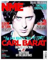
I'm also adding this image as an example as the picture has
been taken in a similar way as the above example, however the model is male
therefore it gives a different look and feel to the magazine and also targets a
different audience. I think this will be something I consider when re-taking me
images for my magazine. However I can't use makeup ideas and some of the props
that I was considering. However it will give me the opportunity to use
different themes and colours with a different artist however the same genre.
Again with this magazine I prefer the layout I created on my draft rather than
the layout on this example. Also I am going to experiment with different font
faces in my next draft in a way like example 2 has to create more interest on
the magazine. I'm considering the idea of using a quote in a different font to identify
it from the article title.
All these things in to consideration about the image and
layout, I think I also need to change some of the elements of the things on the
page. I have left out a conventional barcode and I think the cover could use a
issue number and the article names down the sides could be smaller. I could
also reconsider the font however I don't think the front is much different from
the types of fonts on the examples. I've noticed they use capital letters and
cap lock for their covers which is an idea I could consider. Also could
experiment with the use of the 3 conventional colours and swap and change these
to see what works best. The colours that I used for my draft I chose because
they complimented the image I had taken, however re-taking my image would allow
me to plan for better suiting colours.
No comments:
Post a Comment