Draft 2
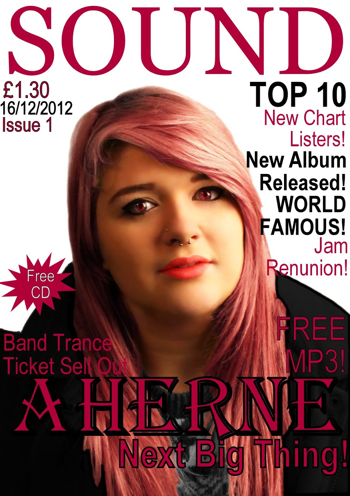
This is my second draft. The image I had previously used on my draft 1 I used again, I have photoshopped this image to create this look. I have airbrushed her face and skin and lightened it to create a better complection. I have also changed the colour of her eyes from green to red because it attracts the eye more and looks as if she has contacts in which a lot of emo/scene crowd actually wear. I have also changed the colour of her hair from brown to a pink/red colour, I did this because it is very themed to the current trends of hair colours the scene/emo background are taking on. I also changed the colour of her top to make it a grey because this fits and compliments the other colours.
I changed her coat from a brown colour to a brown to a black colour to create a darker look, it also contrasts well agains't the background. I think by doing this it creates a cape/vampire look which could also suit a twilight type of audience, this target audience has increased in the last two years so I think this works well. I decided to change the lip colour to a bolder red however I made this look more natrual. I kept the layout similar however I changed the font for the feature article because it looked more theemed within the magazine. I also cut around the white background on this one to create a competely white background.
Improvements I could make on this design is a different colour scheme because the colour of the models hair and the colour of the font and her jacket clash too much. I liked the idea of the colours pink and black however now i've put them into practice I have changed my mind and think red and another colour would of suited better. I also only have 2 main colours on this magazine, it is conventional that there are 3 main colours. If i was considering using this as my final design I would add a white or grey coloured text also within the page.
Overall I am happy with this draft however I have decided that I am not going to use this draft as my final draft due to the imagery still not being right for the magazine type I am going for. However I prefer this draft to the previous draft, and i've tried hard on photoshop to adapt the picture to fit within the conventions of the music genre.
I think that doing this draft increased my photoshop skills and I have learn't how to do things more to create a look and theme on photoshop. I think with the image I had i've created the best looking magazine possible and its increased my understanding of photoshop and I have learnt a lot by doing this design. I think this will influence the rest of my designs and I will use the skills I have learn't to produce a new design with a different picture.
No comments:
Post a Comment