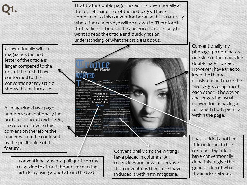
Conventions on individual pages


-
Conventions overall
Throughout my magazine I have tried to achieve continuity between all of the pages of the magazine. This is a convention used in magazines, for example the text of the 'Trance' band the font is the same throughout and it shows visually that the feature from the front relates to that article. This creates an identity for the band also within the magazine, it is then easier for the 'Trance' fans to locate this article within the magazine. I think this shows a more professional approach to my magazine also. I have even done this within the article text itself to re-enforce this ideology.
Also within my magazine I have used different pictures to suit the page I was creating, however I have used the same model and person. I have even created the same kind of style within the photograph and edited it in a similar way. I have kept the black and white as I think it looks more professorial and it created a theme throughout, it also allowed the text to stand out better than having the picture in colour. Also within the magazine industry conventionally it should have 3 colours that are constant within a magazine. I have tried to achieve this by using black and white however mostly blue. I think the blue colour has created a theme for my magazine overall, this is very different from the ideas I had at the beginning of my task. All these are conventions of a magazines and the ideas that I have taken form researching other magazines and adding them to my own.
-


Comparing to current products, and their conventions
I have used these examples of the music magazine NME for
inspiration for my magazine. I have used some of their conventions on my own
pages. I took inspiration with the colour scheme, I liked the convention of
having a black and white imagine and using these colours within the text, along
with another colour to create the 3 conventional colours that I needed. I have
used the ideas from the double page spread of having a pull tag around the text;
this is conventionally used within magazines to draw in the audience. The pull
tag from the NME magazine example is a quote from the text that will interest
the audience. This is something I took and re-created on my own magazine, within
the article I wrote I decided on something that would draw the audience in and
created this as my pull tag. I put this almost the article as this is often
done within magazines. I think the idea of putting it within the actual article
is better than the magazine example; this is because it draws the eye directly
to the article and attracts the audience to then read the article.
Within the front cover example I have taken inspiration from
the bar going along the top of the magazine displaying information; however
within my magazine I've placed this convention on the bottom of the page. I
have used a similar layout and my inspiration for my layout came from NME products,
however I’ve swopped some of the conventions around. For example I have placed my feature heads in
the conventional right hand side of the page, this is to conform to the
conventions that NME use, they are successful and work on the retail market therefore I have
applied them to my magazine. I have placed the barcode in a similar place to
the example as through my research most magazines in general not just in this
genre have their conventional barcode in the right bottom corner. Also underneath the title of the magazine it
has the issue number and the date, this is something I’ve achieved on my
magazine. I have also placed the price for the magazine in bold underneath;
this is also something that is inspired by the example NME front cover.
These products also inspired my photography conventionally
all magazines have photography; however it can be edited in any way that fits
the photography type. I took these examples and decided to create something
that would fit to be edited into black and white. I did this because I liked
the contrast between the coloured article features and the black and white
background. Some magazine covers are
conventionally edited in colour, however I have decided not to do this and make
the features a main focal point to draw in potential buyers. Within the double
page spread from the photograph that I have used like the example they both
have a negative space background, with positive background. This means that the
background for the photograph is dark and the writing is light, this is not
conventional of text, however is often used in magazines. I think this works
well and looks better to the conventional negative on positive because its more
interesting and draws in the audience more.
No comments:
Post a Comment