Monday 17 December 2012

Improvement


Example 1
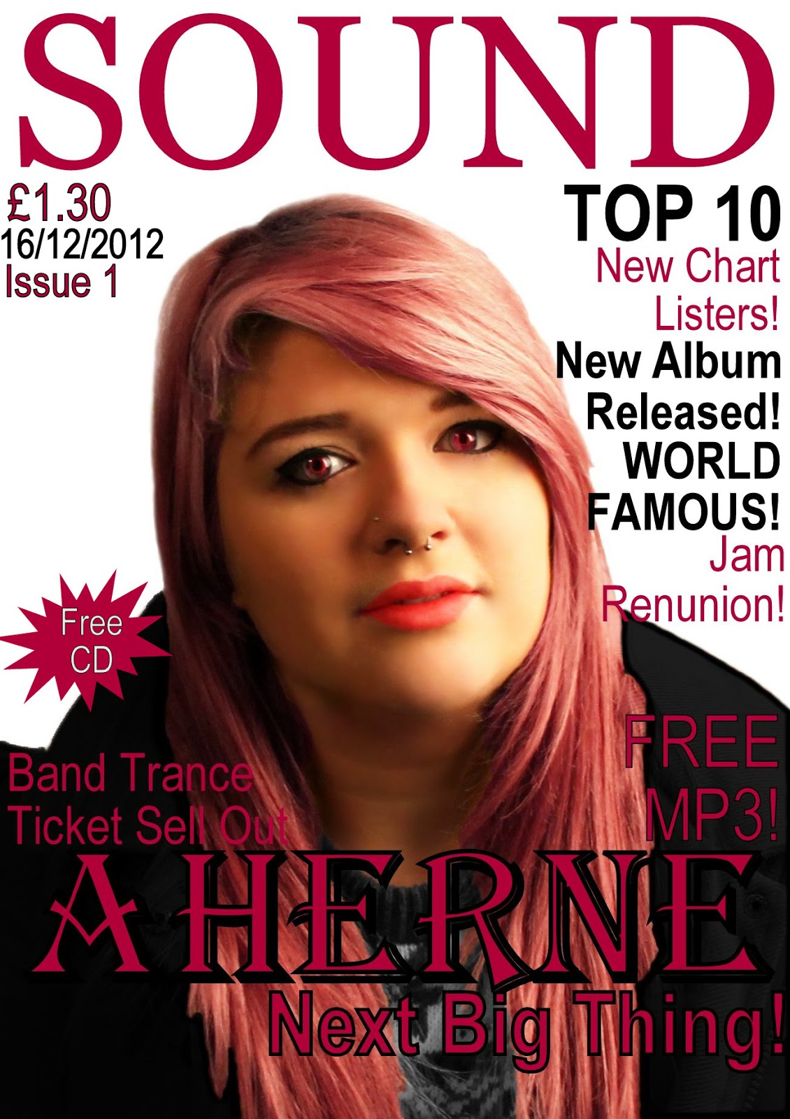
The above is the type of shot I am considering for my front cover, think this position and layout works better than my draft one; however I’d 
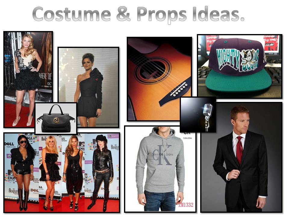
like to incorporate a prop that represents music. I like the idea of having all the hair as a background as I found in my draft it was hard to add text with the busy background or the coat and its detail. I like the contrast in the examples colours and It looks glossy and far more appealing to the young target audience I am aiming at. Although I like the image on the example magazine I prefer my layout, I am going to continue to use this layout for the remaining drafts I will complete. I also think I should take the text size and pull tag size on board; this is because my first draft the text dominates the cover and leaves only a small visual space for the image. I am going to enhance the close up of the image and make the pull tag smaller. I also think the master head is oversized, and there should be more articles and text if I descale everything. I think I also need to experiment more with makeup ideas, and see how this affects my image. Although I'm struggling to get the correct look and make it look visually like a music magazine. All these are things I can take inspiration from to create a better magazine.
 
Example 2
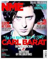
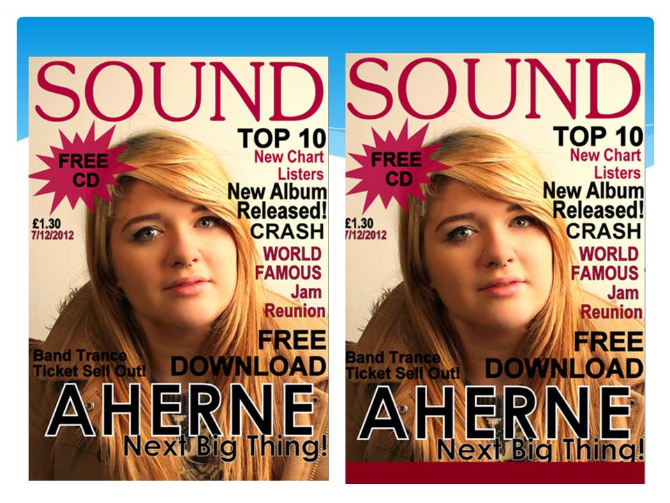
I'm also adding this image as an example as the picture has been taken in a similar way as the above example, however the model is male therefore it gives a different look and feel to the magazine and also targets a different audience. I think this will be something I consider when re-taking me images for my magazine. However I can't use makeup ideas and some of the props that I was considering. However it will give me the opportunity to use different themes and colours with a different artist however the same genre. Again with this magazine I prefer the layout I created on my draft rather than the layout on this example. Also I am going to experiment with different font faces in my next draft in a way like example 2 has to create more interest on the magazine. I'm considering the idea of using a quote in a different font to identify it from the article title.
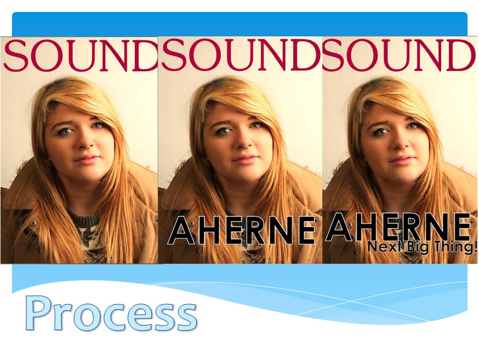
All these things in to consideration about the image and layout, I think I also need to change some of the elements of the things on the page. I have left out a conventional barcode and I think the cover could use a issue number and the article names down the sides could be smaller. I could also reconsider the font however I don't think the front is much different from the types of fonts on the examples. I've noticed they use capital letters and cap lock for their covers which is an idea I could consider. Also could experiment with the use of the 3 conventional colours and swap and change these to see what works best. The colours that I used for my draft I chose because they complimented the image I had taken, however re-taking my image would allow me to plan for better suiting colours.

Sunday 16 December 2012

Front Cover Design 2.

 
Draft 2
 
This is my second draft. The image I had previously used on my draft 1 I used again, I have photoshopped this image to create this look. I have airbrushed her face and skin and lightened it to create a better complection. I have also changed the colour of her eyes from green to red because it attracts the eye more and looks as if she has contacts in which a lot of emo/scene crowd actually wear. I have also changed the colour of her hair from brown to a pink/red colour, I did this because it is very themed to the current trends of hair colours the scene/emo background are taking on. I also changed the colour of her top to make it a grey because this fits and compliments the other colours.

I changed her coat from a brown colour to a brown to a black colour to create a darker look, it also contrasts well agains't the background. I think by doing this it creates a cape/vampire look which could also suit a twilight type of audience, this target audience has increased in the last two years so I think this works well. I decided to change the lip colour to a bolder red however I made this look more natrual. I kept the layout similar however I changed the font for the feature article because it looked more theemed within the magazine. I also cut around the white background on this one to create a competely white background.

Improvements I could make on this design is a different colour scheme because the colour of the models hair and the colour of the font and her jacket clash too much. I liked the idea of the colours pink and black however now i've put them into practice I have changed my mind and think red and another colour would of suited better. I also only have 2 main colours on this magazine, it is conventional that there are 3 main colours. If i was considering using this as my final design I would add a white or grey coloured text also within the page.

Overall I am happy with this draft however I have decided that I am not going to use this draft as my final draft due to the imagery still not being right for the magazine type I am going for. However I prefer this draft to the previous draft, and i've tried hard on photoshop to adapt the picture to fit within the conventions of the music genre.

I think that doing this draft increased my photoshop skills and I have learn't how to do things more to create a look and theme on photoshop. I think with the image I had i've created the best looking magazine possible and its increased my understanding of photoshop and I have learnt a lot by doing this design. I think this will influence the rest of my designs and I will use the skills I have learn't to produce a new design with a different picture.


Sunday 9 December 2012

Original image.


This is the original image, to get to this stage I set up the studio lights to position were I was happy with the lighting. I used the soft box to create a much softer natural light, then used a spotlight to enhance the models face. This picture was the best result I got in the studio, I think this picture worked well because of the reflection in the models eyes and also in the piercing. This photo has been Photoshopped, I've airbrushed all the skin and enhanced the colours within the picture. I've also changed the brightness and shadows within the picture and changed the levels. I also need to make the photo closer as it leaves too much room for text around the edges. Even though I created a draft from this image I have decided not to use this image in my final design as it doesn't relate to music enough and looks more like a college magazine photograph. I want to take a image that idenifies to the audience straight away that it is infact a music magazine, and portray parts of the genre that i'm trying to reflect.

Friday 7 December 2012

Magazine 1

 
My First Draft
 
This is my first draft that I have produced. I am reconsidering the image I have used now I have reviewed my ideas. I would like to use a better image that represents music, and visually displays that it is a music magazine. I think I could improve my image by dressing her up and doing makeup differently, I could also use props and things that represent music such as drum sticks or maybe a band t shirt. I think I'm going to use a different model also to create a different look. I'm however happy with my layout of the magazine, and I like how it is positioned on the page. I however have decided now that I am not going to use this as my finial magazine.

I think if I had decided to use this image I would of cut around the image and created a complete white background, instead of having the different tones of the studio behind the text. I needed to have more makeup and I could have photoshopped the image futher to create a look that would be more fitting within the magazine. This is the consideration I am going to make in my next draft with the same image. If I was going to use this image for my final magazine design then I'd have to adapt it to fit the theme and style of the magazine. I think the main issue with this draft is that the genre of music is not expressed enough. However I think my feature names are very broad so that it has a wider target audience.

I also think I need to re-consider my theme of colours and which colours to use. I don't think the pink, black and white theme works well, however it compliments the colours in the photograph. However it doesn't compliment the colours of a music magazine. I think brighter colours such as yellow red or blue would fit better, I don't think it helps that the background is not pure white. I think overall this is a good attempt for my first draft and it got me used to all the tools and uses of photoshop, and the different things you can do to change and adapt things to fit a magazine.


Magazine 1 Process


Process
 
This is my first front cover and the process in which I found my end result. Within the magazine front I have used the following conventions: Pull tag and free offers, large feature text, text around the outside of the picture and also the date and cost of the magazine. The 3 conventional colours I have used are red, black and white. I have decided on the name Sound as the name relates to any genre of music therefore the magazine can be more diverse than I first planned. I think this will attract a wider audience and more people can enjoy the same magazine.

I have used a conventional mid shot photograph as the background as this works well as a front cover. I am happy with the end result of my editing and creating the cover. Within this process I have not put a conventional barcode on the draft or a conventional Issue number. In my next draft I have decided to use a different picture or to adapt this picture, therefore I am not using this draft.
In the first stage I added text on the picture in photoshop using the text tool. to create the a bar along the bottom I used the block shaped colour tool. I also created a coloured edge around the main feature to create attraction I did this again using the text tool. The shape around the pull tag I created on a program called piknik because I found it difficult to create it in photoshop. Then I re-opened it in photoshop and added text on top of the shape. Whilst I created my magazine I printscreened the stage I was at and put together this step by step within Powerpoint.

Tuesday 4 December 2012

Examples of Existing Products.


These are examples of current music magazines, these are all very successful and personally I would consider these to be the most popular. I have chosen these as my example products because they show the conventions of a magazine well and I can take inspiration from their layout, competition ideas, pricing, picture  layout and also the types of names consumers attract.

Saturday 1 December 2012

Different fonts.

These are some of the fonts I thought would look good for my magazine. The ones I like the most is number 3 and number. This is because they are both very different and if I used this font on a magazine it would create more of an identity for the magazine Number 3 is very street looks and is how teenagers or skaters do graffiti or artwork, this would be perfect for the target audience I am aiming at, It would catch their attention better than the other fonts I've collected. Number 1 is almost like a collage, I think this font works well on magazines for things such as a cover line or name of a band. This again is very distinctive and people may start reconsigning the magazine for this convention. However all these fonts I am going to consider when creating my final design, I will experiment to see what works well and what doesn't. 

Final Ideas.


These are my final ideas for my magazine, I want to go for a emo/scene look and target this kind of audience. I think this audience is a good audience to target as they already put a lot of money and effort in to following their look and music. Current magazines already show that this is a good magazine so target and that this type of magazine does sell. This genre of music also gives me the oppertunity to experiment with colour as they have bright colours and bold hair styles.
 
I've decided to do this genre because the look and image is very distinctive, I think I could recreate this look and produce something I am pleased with. I have chosen some example magazines for the text and ideas on layout.

The makeup is very visually distincitve and stands out. I think this works better than the natrual makeup ideas, this is due to the fact it draws the audience in better than the other makeup ideas which may be overlooked. Also a lot of these ideas have sharp edges and points within them, this includes the eye makeup and hair, this creates a bold look.

Our groups behind the scene footage.


This is a clip of my groups behind the scenes lighting, we experimented with different lightings using the background and lights within the clip. We used each other as models and created different images using the lighting and positioning of the model, we also used props too. I think making this behind the scenes footage was useful to show the location of the photo shoot and how we arranged the lights.I think on a whole our photo shoot was successful, however if I was to do the shoot again I would fit the location and back drop more to the genre of my magazine. Overall I did learn how the lights work within the studio and what effects they created.

Behind the scenes example


This video is a behind the scenes special inside look in to the way photographs are taken, the positions the stylist put their models in. Also looks at the type of makeups and clothing, and also the mood boards that inspired the look. I think this is a good insight to how and where the shoot was taken. I have taken inspiration from the behind the scenes footage, and I am trying to do something similar with my photoshoot. 

Monday 12 November 2012

Pose ideas for photoshoot.


These are some pose ideas I put together. All these are very different and gave me a lot of ideas of how I should positon my model within the scene. The poses I think would work well for music are the mid shot poses, this is because this is conventional of a music magazine. I think the up right/standing pose compliments the layout of a music magazine as it works well with portraiture, this is unlike the laid down poses which would look better on a double page spread which is more landscape.

Makeup Ideas.


I have chosen these makeup ideas because they are quite made up, however the colours are quite natrual and compliment the model without over powering them. I think this would work within a music magazine because I could adapt the colour to suit the magazine colour and themes. I think this type of model looks better agains't the conventional white plain back drop so the attention is focused mostly on them. If I was going to use these ideas, I would use them in this way.

Sunday 11 November 2012

Music Magazine Layout.


College Handwritten Plan


Magazine ideas


Ed Sheeran

I am a great fan of Ed Sheeran and he is widely popular within the UK. I think he is a great example of an artist that I could use within a magazine for the UK. I recently went to one of his concerts and I took images of the concert to use within my blog, and possibly my music magazine too. I love the types of clothes Ed Sheeran wears and what he represents in the UK music market. I will use this qwerky look in some of the aspects of my magazine.  

Costume & Props ideas.

I decided that the red carpet look was a good idea for a costume for music magazine, especially the woman's costume. I decided this because people within the music industry wear a lot of expensive outragous catwalk red carpet dresses and costumes. In regards to costume I think an expensive looking bag would work well with this outfit, this is because of the conventional advertising point the current magazines in the market have. I think the look of Ed Sheeran and other acoustic singers have is a relateable current look in fashion, and if the magazine was to be aimed at this market it would work. The current fashion on snap back caps would work well within a rap magazine, or something relating to that genre. All these ideas I will take in to consideration when creating my own images.

Own photo's of Ed Sheeran concert.


These are my own photo's that I recently took at an Ed Sheeran concert. I decided to use these within my blog, because this is the genre of music I was considering to use within my magazine. I thought some of these pictures would look good within the content or double page spread of my magazine. These pictures also have a variation of lighting, these lighting ideas may influence the way I take my own images.

Tuesday 6 November 2012

Location ideas.

These are a few of the locations I looked at when deciding how to create my images. I think the ideas that work best is the concert enviroment as this is conventional to the genre of the magazine. However I think this would work better within a double page spread because of the landscape layout of the pictures. The other location I thought worked well was the white back drop, this is conventional of magazines and front covers tend to use this background. All the ideas I came up with for location relate to the genre which is music.